8 UX Tips to Improve Your Ecommerce Website
No matter how careful you are setting up your eCommerce website, you won’t get everything right. Here are 8 UX tips to improve your website today.
Setting up an eCommerce website isn’t easy.
It’s not enough to just have a quality product and put it online. Users will be looking for much more than that from your webshop – they’ll be demanding convenience, functionality, and ease of use, to start with. In other words, they’ll be expecting a good user experience (UX).
To understand the value of UX, you don’t have to be an owner of an online shop. At least once in your life, you’ve given up on a website because you couldn’t navigate it properly. Or because it was too slow. Or because you couldn’t find any photos of the product.
Keep in mind that 88% of consumers are less likely to return to a website after a bad experience. And when you think about it, this is perfectly predictable – just like people don’t go back to a restaurant because of rude waiters or loud music. And in the digital world, it’s all about creating an experience.
This is where UX comes into play. By following the best UX practices, you’ll provide a smooth customer journey to the users and make sure they don’t get distracted, interrupted, confused, or slowed down. Here are some valuable UX tips.
1. Keep your eCommerce website simple
Before we turn to the more specific tricks of the trade, let’s introduce one general rule you should keep in mind at all times. It’s nice that you want to have an eye-catching design and numerous special features, but it’s very easy and very dangerous to overdo it.
Remember, people want convenience, not aesthetic perfection or fancy design tricks. The point of an eCommerce website is not to stun the consumer, not to overwhelm them, but on the contrary, to ensure that they can effortlessly navigate the site and easily perform desired actions.
Thus try to avoid flashy design elements that can damage the performance of your webshop, like image carousels, parallax scrolling, or unnecessary custom animations. In this article, we’ll see several reasons why this is important.
2. Speed up your website
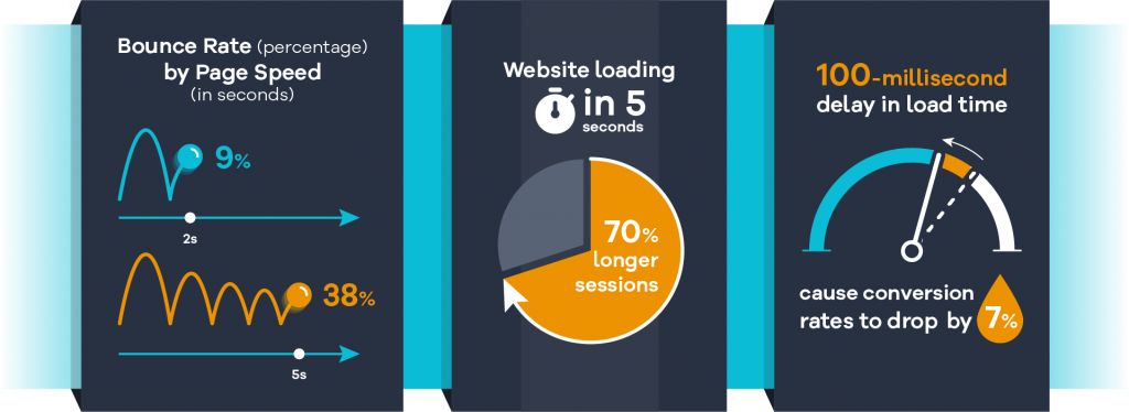
The first reason is definitely looking after your page loading speed. Every extra design element you add makes your website “heavier” and slows it down. You’d be surprised to see how a fraction of a second can make all the difference between a lead and an annoyed user who’ll never return again.
A slow website usually can’t be fixed with one simple trick. It has to be impeccably built, both in terms of structure and design, and you need to think through every feature before you decide to implement it. Will it slow down page loading? By how much? Is it worth it? Is it overkill? You’ll need to ask that many times in the process of developing the website.
However, if your site is already up and running but you’re not happy with its performance, there are still a few things you can do to speed it up. You can try minifying HTML, CSS, and JavaScript files, compressing large images, enabling cache, or searching for fast hosting options that can support your website properly.
3. Make navigation easy and intuitive
One of the most certain ways to lose a potential customer is by failing to ensure clear, straightforward navigation. Users have to feel confident about browsing your website, and they have to genuinely understand how your website is structured, which page they’re browsing at the moment, how to find specific category pages, or how to find menu bars.
Your biggest ally here is simple and intuitive site architecture. If your website is structured in a logical way, your navigation can simply follow this structure. So make sure that your categorization is clear and specific, without confusing classifications and overlapping sections.
As for other things you can do to improve navigation, it’s probably best to have a fixed menu that won’t be disappearing all the time, unless the user is on a mobile device where fixed menus can easily annoy them. Moreover, try sticking to the three-click rule, which states that a user should be able to find any information in just three clicks, wherever they happen to be on a website. Also, employing breadcrumbs can additionally help users find their way around.
Finally, a well-positioned, functional search box is a must. Namely, research shows that 60% of online purchases are not impulsive, which means people often know what they’re looking for, which in turn means that the fastest way to find it is the search box. Provide them with various filters so they can customize their search and prioritize search results. Features such as predictive search and autocomplete can also be quite useful.
4. Use mobile-responsive design
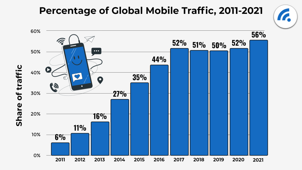
You don’t need to be an expert to realize why you should optimize your website for mobile users. You just take a look around you. People today use mobile more than desktop devices to browse the internet, and they tend to shop online while they eat, walk, stand in queues, or procrastinate at work.
In order to keep mobile users on your site, you’ll need a mobile responsive design. If anyone opens the desktop version of the site from their phone, they’ll be very likely to just give up. It’s not just about the different shape of the screen that makes pages look weird, but also about mobile devices having a completely different set of design rules and priorities.
When it comes to design, the mobile version should be even simpler than the desktop one. It should have even fewer distractions and fewer elements whenever possible. Try to break complex tasks into smaller ones so that there’s no more than one action per screen.
Also, provide instant audio or visual feedback for user actions so that you never leave them wondering whether they have bought an item or added it to the cart, or performed no action at all. Avoiding this confusion can be very important for improving the shopping flow.
5. Create useful and relevant product descriptions
Product descriptions are a huge part of eCommerce UX. If you can present relevant information about the product transparently in as few words as possible, you’re good to go. If not, you’re in trouble.
If your description is too short and uninformative, it will probably leave users unsure whether they really want the product. On the other hand, if the description is too wordy and difficult to read, consumers will lose their patience. So you’ll need to find a very fine balance here.
One of the tricks you could employ is breaking descriptions into sections, such as “size”, “price”, “ratings”, or “special features”. That way it’s more readable, more concise, and easily scannable. Around 70% of users are more inclined to look at lists with bullets, so you should take advantage of that.
Even more importantly, you’ll need photos. It’s simple – whatever you’re selling online, there are probably a ton of people or companies doing the same. So if a visitor can’t take a good look at the product they won’t risk buying it, as they can just go to another website, check the photos, and decide whether to go for it. Photos don’t have to be necessarily HD, but they need to show the product clearly and truthfully, from multiple angles.
And if you have resources (and quality hosting) you can add video demonstrations to product pages. They are proven to be very helpful to potential customers and that they increase conversion rates by 80%. People feel more confident when they see the product in action and in movement, so it’s much easier for them to make any buying decisions.
Discover How SpotlerCRM Can Help
6. Enable recommendations and let users explore your shop
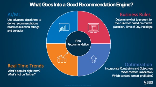
There’s been more and more talk about the power of recommendation engines lately. We see them at work every day, and their biggest strength is personalization. The ultimate criteria whether something is suggested to you is not only that it’s popular or trending, but that you specifically will probably like it. And that makes all the difference.
Recommendation engines can suggest and sort products based on various parameters. For instance, they can do it because you just bought a similar product, or because other users often bought the two products together, or they can recommend products based on your browsing history.
You’ll need not only a powerful recommendation system but also a ton of reliable, accurate customer data in order to produce the most effective suggestions. If you have the needs and possess the resources for that, you can even set up an entire “discovery” mode that will let your customers explore your products more conveniently.
7. Create a clear and straightforward checkout page
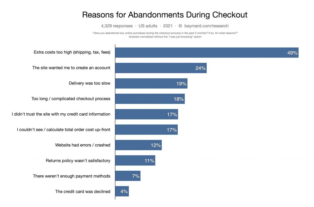
Finally, we got to the checkout. The fact that the potential customer is at the checkout page doesn’t mean that your work is over. On the contrary, it’s critical not to make any UX mistakes at this stage, as it could hurt all your previous efforts. Baymard reports that 18% of shoppers abandoning their cart do it because the checkout process was too complicated for them.
To prevent that, first of all, be transparent. Lack of transparency often results in confusion for customers, and it makes businesses look like they’re hiding something.
Transparency makes you look legitimate. Once a user opens the cart with the previously added items, you should show them their order summary. Make it concise, easy to read, and easy to modify. This way there can be no dilemma about what the user bought, how much it costs, or when the product will be delivered. If the customer changes their mind, they can easily change the order as well.
And once users make a final decision to buy, don’t bore them by asking them to sign up or fill in a ton of additional info. People hate when you ask them to register before buying and almost a quarter of them are ready to abandon the cart because of that. So, once again, avoid distractions, avoid interruptions, and avoid unsettling them with too many demands or options.
Unless we’re talking paying methods. In this case, try offering as many alternatives as possible. A multitude of paying options, as well as the highest level of security are two absolutely critical elements of a successful checkout page.
8. Don’t ignore the feedback
No matter how careful and meticulous you are setting up your eCommerce website, you won’t get everything right the first time. And in order to figure out what exactly you didn’t get right, you’ll need to continually collect and analyze your website’s key metrics.
This way you’ll be able to find out more about your customers as well, not just your website. These analytics will help you discover what works for your industry and for your target group, in terms of much more than just UX.
Remember that providing good UX always comes as a consequence of genuine care about what consumers expect from browsing and shopping. Thus listening to their feedback and responding appropriately is of utmost importance for your eCommerce business.
Really Simple Systems is now Spotler CRM
The same great technology, a CRM platform that is focused on the needs of B2B marketers, provided by the same great team, at a great price!


