Rolling Out Our New CRM User Interface
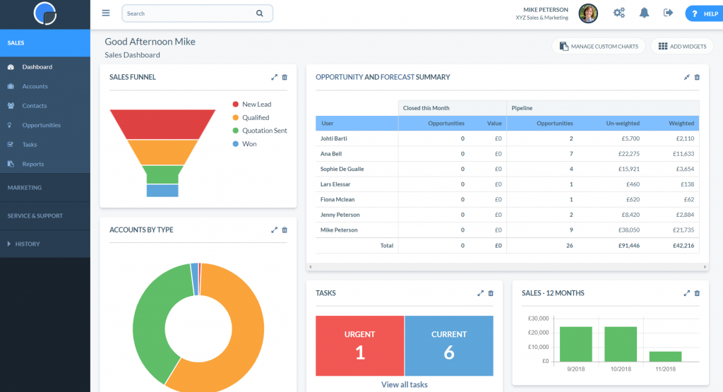
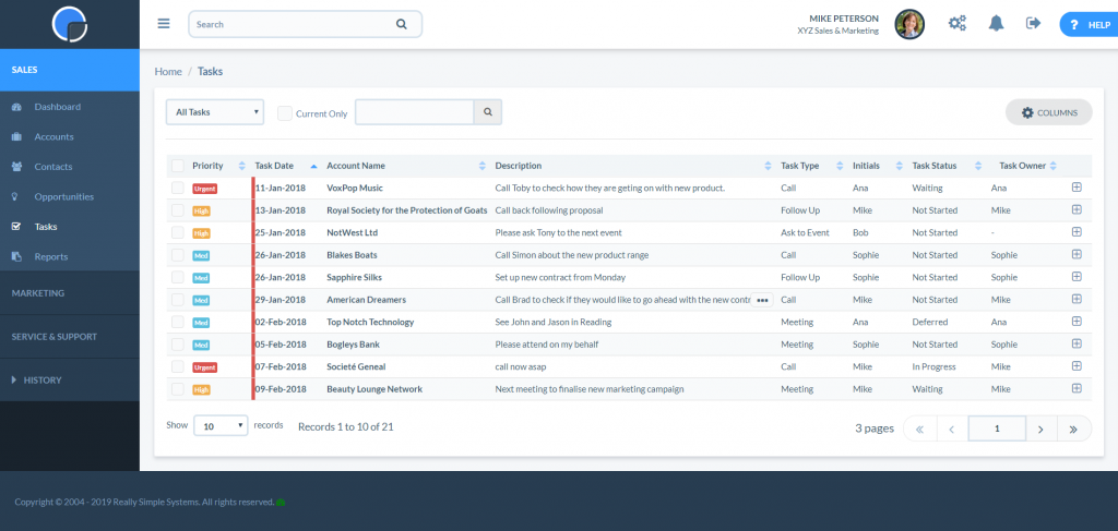
Our new user interface gives a fresh, modern look to our CRM, making it really easy to find and view your data.
It will come as no surprise that the SpotlerCRM mantra is “keep it simple”. It’s important to us that we champion our small business users. this means constantly asking ourselves what more can we do to apply this ethic to our CRM.
Whether we are developing new features or updating existing ones, it’s often a real team effort to iron out any unnecessary complexity and make our CRM easy to use.
The CRM market is fast moving and, even at the small business end, new feature developments are required to keep up with customer demand. The beauty of cloud technology means that what was a major financial outlay for large corporations only a few years ago can today be an affordable reality for small business owners. Yet without a huge team of IT specialists, implementing these tools can be less realistic. This is where the SpotlerCRM intent to simplify becomes imperative.

Website Design and CRM User Interface Consolidation
Just a few weeks ago we launched our new website, creating a clean and contemporary look for SpotlerCRM. And furthermore, making it easy for visitors to find the information they need. While developing the website we were inspired to also look to incorporate the new brand identity into the CRM User Interface (UI), building a cohesive international brand across both.
In the coming days and weeks, we will be rolling out this new updated version of our CRM UI. The changes will consolidate the branding across our product and our marketing.
What’s New?
Looking at what’s changed, it would be tempting to say, not much! The last thing our customers need is to learn a new system every time we make an update. It would be like going to the supermarket and the aisle layout has been changed! The UI differences are quite subtle but make the screens simple, clean and clear. So it’s easy to navigate and find the information you need.
Consistent Styling
We’ve concentrated on being consistent with the page layout so that the grids and buttons are always where you’d expect to find them. You’ll see we’ve tidied up the screens to minimise the “dead” space and added some shading, making data search easy on the eye. And we’ve also grouped some of the functions so you can find what you want quickly. Other aesthetical changes include making the shape of the buttons the same as on the website and using tone and colour for a more attractive CRM.

The new interface has been further optimised for mobile use. As a result users can easily access their data on the go and monitor their company data.
Switch Over Period
Even though the new UI has been beta tested for some time, we’re rolling out the changes across our customer base in stages, just in case something unexpected happens. Starting with existing customers using the Free plan, we will then switch other customers over in stages.
We hope the changes will come as a pleasant surprise . It’s likely that some customers will not be sure what’s changed but will realise that something is different!
We’re confident you’ll like it!
Really Simple Systems is now Spotler CRM
The same great technology, a CRM platform that is focused on the needs of B2B marketers, provided by the same great team, at a great price!